Stimorol - Refreshing Packaging Design Contest
Retrolicious by Dareen
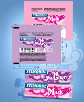
These designs were inspired by the polished and nostalgic characteristics of vintage letterhead typography. Traditional letterhead typography has proven its timelessness and longevity and has been reintroduced and reinvented in fresh and unique ways. It’s classic pop… much like Stimirol! A quirky blend of old and new sees curved edges and cheerful colours come together in a design that packs a powerful punch with a fun bubblegum vibe. The intention behind each variant’s design is that you should almost be able to taste each flavours just by looking at it. Each variant name is crafted to create an easily identifiable pop-styled icon that will appeal to all ages – creating a kind of stickiness that makes the flavours easy to identify and recognise. The original variant colours have been respected to ensure that loyal consumers will still find their favourite flavours with ease. When packed side by side, the individual packs come together to create an overall and unified pattern.