Stimorol - Refreshing Packaging Design Contest
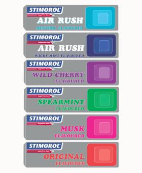
STIMOROL_RETRO by cbreeze
Show me another design
Avg Vote Score : 1.35 About this Design : Uploaded on Apr 04, 2021
I went with the retro style color blocks to represent the different Stimorol flavours- the muted background(silver foil)is to make the colors pop and attract the eye and I chose the font because I thought it ties in with the retro theme.The idea of the blocks is that they remind me of a control button(cellphone,game controller,etc-the twist on modern)everything we love including Stimorol...