Stimorol - Refreshing Packaging Design Contest
United by lisalyness
Show me another design
Avg Vote Score : 1.71 About this Design : Uploaded on Apr 11, 2021
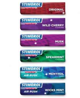
Keeping true to the original identity - keeping the branding strong and using the logo and colour coding as it was. The combination of all the packs make up the map of South Africa, showing how we are a country of different "flavours" that combined make a whole nation, each variant also stands solidly on its own. There is a star from the logo placed on the location of the major cities.