
 Kitten Licken by CHUCKY
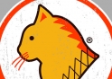
This one’s for South Africans. Yip, it’s the asian rip-off of the very well known South African chicken franchise! If you were wondering, “Seoul” is the capital of South Korea.
Kitten Licken winning design with CHUCKY by DuncanBoxie
CHUCKY just keeps on winning. This styling designer keeps coming back with original design after original design. This time around he blows us away with a parody that all South Africans can appreciate!
1. You seem to be a big fan of parody design, do you feel as if its an important part of your work?
I do enjoy the rip-offs, in fact my first win “Taxi Wars” wasn’t funny but was also a parody type design. I’ve mentioned before I love experimenting with new styles, with some being just about the artwork (e.g. Quarantine & Wright out the sky), but it seems the parody style is a strong point for me.
2. What gave you the initial idea for this piece?
I get asked that a lot by friends and family. Its actually quite a funny story because it actually started out as a joke more than anything else. About 2 months ago me and my sister were sitting in a Chicken Licken outside a chinese mall, and whilst looking at a chinese sign, I said “ maybe this is isn’t chicken but actually cat were eating” I know it might sound cruel, but it was really funny and it just grew into a concept from that initial joke, haha.
3. How long did it take you to complete your design?
The artwork was fairly straight foward, it was just a matter of finding the same font and getting the overall look to match the original, so it only took about 4 hours!
4. If you could change anything what would it be and why?
Absolutely nothing! At one stage though I was worried if the “Seoul food” tagline should rather be Soul spelled intentionally wrong like “Suol”, but realised the message was a lot stronger & funnier with “Seoul”!
5. What kind of people can you see wearing this design?
Well to narrow it down, South Africans mainly because the design is a rip-off of a SA franchise. I think it will be worn by both boys & girls and from young to old.
6. Which design do you feel was your closest competitor?
Sebasebi’s “The Crow maker”, it’s a great design! In the beginning I rated Acme’s “U-Dilbeti” because of its similarity to “eSempowenis” but realised it wasn’t quite as effective as “eSempowenis”!
7. Would you rather have this design printed with our UV or glow-in-the-dark novelty inks?
I would prefer standard UV ink. I think glow in the dark would suit more graphic prints or when you want certain details to stand out!
8. We were concerned that some people might get upset by this design. What are your thoughts on this?
At first I was also a bit worried that it would be offensive, but on that same note we shouldn’t take things too seriously, afterall the world is a pretty crazy place (like Lady Gaga wearing a meat dress crazy) and controversy sells!
9. Do you feel as if this design will be a big hit from a commercial perspective?
Yip, I’m pretty sure it will! Parody shirts are usually popular and I was really impressed with the reaction from springleapers, friends & family!
10. Its rare that designs like this win on Springleap.com. Do you think we should have a parody based theme competition?
Yeah, it is quite rare, It’s more of a “laugh out loud” type thing, but in my opinion some of their stuff is too cheesy or silly ! I think parody only works if its really funny or has some sort of message behind it! A Parody theme could be good fun :)
|
Haha dude the “suol” spelling would also have been pretty damn awesome. But yeah I reckon the way it right now is the best bet!
shoutBack on 14/9/10 by DuncanBoxie
|