
 Illuminati Propaganda by suburbanhijinx
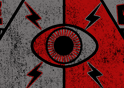
Remember Springleapers…say your prayers, eat your vitamins, and you can never go wrong…or can you? WE ARE WATCHING!
Illuminati Propaganda Interview with suburbanhijinx by DuncanBoxie
There is no doubting the hardcore coolness of Illuminati Propaganda!
Springleap.com design veteran Suburbanhijinx blew away the competition to take the much coveted Roll-Over theme win.
Lets find out more about this stylish paranoia masterpiece!
1. What were you thinking when you first started the design?
Well when I first started the design I knew the pyramid with the eye and lightning bolts was going to be the central focus. I played around with a lot of geometric shapes, halftone patterns, and strokes until I finally got the shape I wanted. Believe it or not the ends of the banners with the “We Are Watching” we’re actually accidental!!! They started as lightning bolts and as I was playing with placement realized they looked awesome as tails/ends of the banner.
2. What made you go for a rough ‘distressed’ look?
Most of my pieces are pretty rough and distressed. For me I just love how that looks, but I think it worked well with the piece because of how old the Illuminati and the conspiracy theories behind them date back. Some believe the Illuminati are responsible for the French Revolution! So to give it a worn distressed look helped go with the theme.
3. How long did it take you to complete your piece?
I worked off and on for 2-3 days on this piece. Probably a total of 10-15 hours…A lot of time was spent on color ways. Once I get everything to look exactly how I want it, I like to see what color tee it also looks good on, and what other color choices are available. I’m trying to think in terms of “what would springleap do” if you have a killer design that the people love and you have many options to print and sell hopefully it will help out with the panel portion of the contest. Also if the design didn’t win, spending that time and having those options makes it an easier piece for me to sell to a band or other client.
4. If you could have used different text what would u have gone for?
That is a good question! WE ARE WATCHING was the really the first thing that came to mind…plus it fit within in the banners. If I didn’t go with “We Are Watching,” I probably would have looked up some old propaganda posters/artwork and or done some more research on Illuminati and tried to find something within that I could have used.
5. Do you think this design would work in one of our novelty inks, UV or Glow-in-the-dark?
Definitely! If you did just the eye and the lightning bolts around it in either one of those inks I think it would come out great. Definitely add to the Illuminati WATCHING factor!!
6. Which design submission of yours did you think would win, this, or Sub-Atomic Intergalactic Ranger?
I honestly thought Intergalactic Ranger would of won if I was going to win this comp. The amount of feedback was amazing when you get 2-3 pages of comments (all positive) and you check out the rest of the other contenders and they only have like 4 or 5 comments total, you begin to think that there is something special about this design…maybe it could win. Plus my girlfriend is almost always able to predict if a design will win. The last two designs I did (Stayin Alive & Apocalyptic Sunset) that won she gave two thumbs up! Loved them and felt they were the strongest in the competition, this competition she had the same feelings about Intergalactic Ranger…Needless to say we were both shocked!
7. Do you personally think that the Illuminati are out there, controlling our every move?
I think there is something out there for sure. I don’t necessarily think they control our every move, but I feel like there is something responsible for some world events. For example when the USA suffered from terrorist attacks almost 10 years ago, the country became very prideful and everyone became very patriotic, then the New England Patriots WON the Superbowl…it’s a coincidence, but still I feel like somethings are nothing more than a WWE scripted soap opera.
8. We saw some of your other color variations. Are you still happy with the color choice?
Yes I am happy with the winning colorway. With my designs I’m always really hot and cold from day to day. Some days I’ll look at it and be like “This is strong enough, let’s try a different color,” Then fall in love with the new colorway and kick my self for not submitting that one…but I’m also very impatient so if I don’t get instant feedback I begin to doubt myself and the design. So I pretty much drive myself crazy! I really do think the red and the gray work well. Originally it was two shades of gray (one light, one dark) on the black and I wanted to bring in another classic propaganda color so I went with red and fell in love with it until the contest started, then the above process happened!
9. Do you feel as if this design could be offensive to any specific party?
I don’t think so…it’s not really in support of and kind of conspiracy group or anything. The theme of the design is just built around it. It may offend and terrify those who are like Mel Gibson’s character in “Conspiracy Theory” though!
10. It is rare for you to not submit designs with a character element. Do you feel that this factor was important for the success of Illuminati Propaganda?
That could be! I didn’t think about that…I usually always need some sort of character or element to start the design off with and build around. In all reality the pyramid with the eye was that element in this design. I don’t know I guess we will see, I am working on heraldry design right now for one of the next comps. That one will be similar to this one in regard to the character. If it does well I guess we are on to something!
|
LOL Jerry…ANNUNAKI on your mind?
shoutBack on 4/11/10 by DuncanBoxie
|
|
|
Awesome Design DUDE!! Cant wait to wear it - make the reptiles know I’m watching them too!!! Keep up the good work!
shoutBack on 4/11/10 by Jerry84
|
|
|
Thanks guys! I’m super stoked to see the final results!! So far every print from springleap has come out AWESOME! I’m sure this one will be no different.
shoutBack on 3/11/10 by suburbanhijinx
|
|
|
Awesome design and very original, was interesting to read your interview gave me more insight of the design. Good work and well done!!!
shoutBack on 3/11/10 by Nadean
|
|
|
Such a great design and awesome insight! Always good to read about how such inspiring designs come about. I just know this one’s going to fly off the shelves! Keep up the good work bro. Looking forward to more mind-blowing designs from you :)
shoutBack on 3/11/10 by Maike
|
|
|
What a fascinating read, thanks for giving us insight into your thoughts and inspirations for this amazing design! By the way, the blank t-shirts for this design are going to the printers today, so we should see the final result very, very soon!
shoutBack on 3/11/10 by CathRon
|
|
|
1984! Big Brother!
shoutBack on 3/11/10 by Eric
|
|
|
I’m glad you went with “We are watching” I think it resonates perfectly with the design and the mythos (if u will) about the Illuminati! Ya dude i reckon you are one of the best designers I’ve seen who uses distressed style….BRILLIANT! I keep nagging the print department when this will be printed…should be very veeeery soon, so I’m happy :)
shoutBack on 3/11/10 by DuncanBoxie
|