Title:
Take 5 (Foc-ing Version 9) ...Song by RyG
Design by:
Stacen Moodley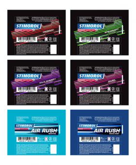
Words by the designer:
On the go - Movement [Check]
Passion [Check]
Fun [Check
Fresh [Check]
Energy [Check]
Base range - to reflect all the above descriptors
Air Rush range - to reflect the above descriptors as well as exaggerating "Energy" & "Movement"
I felt that the Air Rush range design should not just reflect a smaller Stimorol logo, Air Rush Type and two extra colours. The sub range needed it's own identity but also needed to work well when paired next to the Stimorol base range with it's dark background to give a premium feel & allow variants with striking, energetic bands of colour.
Simple yet highly impactful, easily recognisable elements with less clutter on the front face thus allows for greater legibility and brand presence. Simple elements in the design which brings the variants together with shape and also differentiates them with colour.
Iconic design treatment lends itself well with other POS elements such as Free Standing Units, Counter Top Units, Trade Presenters, etc.
shoutbacks
no shoutBacks yet