| shoutOut | last shoutBack | shoutBacks | |
|---|---|---|---|
|
|
Creative Art Intervention: The Black Duke Of Lancaster shoutOut 15 hours, 1 minute ago by travis.lyle1 in peeps |
none yet |
0
show |
Image © Dan Callister www.dancallister.com The ship that now rocks - a true story of creative initiativeYou might have heard about the ship online. Perhaps you saw a photo shared on Facebook. One thing's for sure - the Duke Of Lancaster, a huge ship that has sat off Llanerch-y-Mor on the Dee estuary in Flintshire, North Wales since 1979, has never generated so much attention as it has over the past 5 months. The reason? Call it street art gone right, call it creative initiative or even a colourful intervention, but the results are undeniable - this ship has been given a new lease of life in more ways than one.
Image © Dan Callister www.dancallister.com Built for secret reasons, beached and forgotten about...almostThere's a crazy back story to this massive ship, one that's told in great detail on the site of the mysterious DuDug, who are behind the Duke Of Lancaster's amazing makeover ('DuDug means 'Black Duke' in Welsh, by the way). It's a story that starts shortly after WWII, and takes in the paranoia of the Cold War and the Cuban Missile Crisis, as well as a dodgy spy who was stripped of his knighthood. Turns out the Duke Of Lancaster wasn't built by Harland and Wolff (builders of the Titanic) in Belfast in 1956 to be a luxury cruise liner, which is what it looks like for all intents and purposes, but rather to be a safe and floating haven for royalty and highly-placed members of British society, in the event of a nuclear Armageddon. That of course never happened, and the ship was decommisioned in the mid-1980s, and brought to rest on the Dee estuary, with some plans to be turned into a leisure destination. That, obviously, didn't pan out, and the ship has since sat.
Image ©Annar 50 From maritime memory to front-page newsOver the past two decades it appears that there have been a fair few tussles to keep the ship abandoned, and to have her resurrected. These have involved the ship's owners and the local Council battling it out in court, and eventually the owners giving up. Surpassing all of this, and bringing the ship's fate to worldwide attention, the DuDug crew stepped up 5 months ago by inviting the first of many artists to paint the ship, the first being Latvian artist KIWIE. Since then more artists from all over Europe (including Lora Zombie, Andy Mercer, Bungle, Mr Zero, Fin Dac, Goin, Si Clark and Fatheat) have made their marks, as featured in the images on this page. In the process, the ship and the artworks have featured across all media and have become something of a celebrated art intervention. And there's an upshot - with so much attention, it would appear plans are afoot to restore this amazing ship. As art and design lovers, we at Springleap salute the DuDug crew and wish them and the artists involved many more successes! |
|||
|
|
Great Design Monday: Saul Bass shoutOut 2 days, 16 hours ago by travis.lyle1 in peeps |
none yet |
0
show |
Saul Bass - legendary title sequence and logo designerAs the greatest title sequence designer of all time, Saul Bass's work is mostly noted only by film nuts and graphic designers. This is because for the most part his work is either featured in logo form (where no credits are listed) or on movie posters (where the poster designer is not credited). This, however, doesn't change the fact in terms of numbers, more people have been exposed to the work of Saul Bass than most any other designer of the 20th century.
Movie posters, titles and logo design for over fifty yearsHaving studied in New York City, Bass's career as a designer took off when he began working on title sequences for film, and took on work as a graphic designer in between film projects. As one of the leading identity designers in the USA his work has been expsosed to countless millions of people, but it was his collaboration with renowned film director Otto Preminger on 'The Man With The Golden Arm' saw his work widely recognised for the first time. In the process, Bass developed the title sequence of films and television as an integral part of the content. In his own words "My initial thoughts about what a title can do was to set mood and the prime underlying core of the film’s story, to express the story in some metaphorical way. I saw the title as a way of conditioning the audience, so that when the film actually began, viewers would already have an emotional resonance with it.”
The greatest title sequence designer of all timeHaving started by working with Preminger, Bass became massively popular for title sequence work between the 1950s and and late 1970s, and it would be fair to say that any film or series which introduces credits that sets the tone or provides an epilogue to the actual storyline in some way bears the mark Saul Bass's influence. In his time, Bass designed title sequences for every major Hollywood studio. Toward the end of his career, he was rediscovered by James L. Brooks and Martin Scorsese who had grown up admiring his film work. For Scorsese, Bass created the title sequences for Goodfellas (1990), Cape Fear (1991), The Age of Innocence (1993), and Casino (1995). A design legend of the 20th century? Without a shadow of a doubt. |
|||
|
|
Springleap social media marketing design competitions in your Facebook Fanpage shoutOut on 9/11/12 by 529766679 in wordUp |
none yet |
0
show |
Embedded social media competitionsFor years brands and agencies have wanted to run design contests and challenges in their own pages to access design crowdsourcing and the unique social media experience that user-generated content and engagement provides. The problem: brands and agencies don't have a powerful design community and supporters ready to go and who have been rewarded over time nor the know-how of how to mobilize, maintain and administer the process. That's a lot of pain! It also means a lot of development - which is really expensive. So, at Springleap we've come up with the ultimate solution: our awesome design contests... in your Facebook page! WHITELABELLED!Not only can you easily customize the entire experience to your brand CI (Corporate Image) colours and insert your brand messages, banners and logos - you can run the contest in as many Facebook fan pages as you like! No matter where the designs are entered or where the fan engagement happens - it all appears instantaneously in all the different Facebook fan pages! This means that the amazing designs from the Springleap community appear in your competition on your Facebook page to set the tone for high-quality content and engagement. Here's an example of an embedded brief page below:
1. Design competition with your corporate image look and feel 2. Total customization of the design competition template elements - even the buttons! 3. Your banners - easy upload. 4. Customized sharing tools to send your design contest VIRAL. You get your own brief, submit, vote and profile pages. Best of all - there's no development necessary and you're up and running in no time whatsoever. Here's an example of a vote page:
So you get the whole social media experience - in your Facebook page to engage your brand fans where they belong... but with the awesome Springleap community talent... and you can run it in partner and blogger pages simultaneously to increase your reach. Check out some our success stories with Stimorol, Miller, Nokia and more - click the banner below! |
|||
|
|
Video Friday: The index shoutOut on 26/10/12 by travis.lyle1 in peeps |
none yet |
0
show |
Video Friday: The indexOur Video Friday posts feature the best in film, animation and moving image that we can find. If you've seen any of them, you'll know that we cover a wide range of moving picture genius including classics from the dawn of film to the latest in cutting-edge CGI. Here's the list so far - keep an eye on this, we'll be adding more every week! 1. H5 - 'Logorama'2. Salvador Dali + Walt Disney - 'Destino'3. Terry Gilliam - 'Storytime'4. Walt Disney - 'Steamboat Willie'5. Fabrice o. Joubert - 'French Roast'6. Daniel Levi - 'Henry'7. CRCR - ''Les Chiens Isolés'8. Salon Alpin - 'Much Better Now'9. Andrey Shushkov - 'Invention of Love' 10. Malcolm Sutherland - 'Umbra' 11. Osvaldo Cavandoli - La Linea #1 12. Olivier Delabarre, Thierry Marchand, Quentin Marmier - 'Oktapodi' 14. Monty Python's Flying Circus - 'Dead Parrot Sketch' 15. Lego - 'The Lego Story' 16. John Kars - 'Paperman' 17. Matt Groening - 'The Simpsons' Episode 1: 'Good Night' Stay tuned for our weekly Video Friday posts - there's lots more where that came from! |
|||
|
|
Video Friday: The Simpsons, First Ever Episode shoutOut 5 days, 16 hours ago by travis.lyle1 in peeps |
none yet |
0
show |
The first-ever Simpsons episode (1987)!On Monday the 23rd of March, 1987, a little-known animator named David Silverman walked into a meeting in Los Angeles, and walked out with a job from a guy named Matt Groening. The job? To animate a 30-second short The Tracy Ullman Show. Between Silverman and fellow animators Wes Archer and Bill Kopp, they created the first short in record time, and it aired on April 19, 1987. The rest, as they say, is history - Groening's weird yellow family went on to become one the biggest comedy icons of all time, and the series the longest-running animated program ever.
From sketch to 519 seasons - longest running animated series everWatching early Simpsons episodes of Homer, Marge, Lisa, Bart and Maggie, the striking thing is how much they've changed over the years. Early sketches such the one above and below, (which are owned by David Silverman) and the episodes themselves reveal them to be prototypes of the characters the world has come to know so well. Facial features, hair and general body shape have yet to achieve the standardisation which later versions conform to. Another interesting aspect is the voice-overs - though many of the same voice actors such as Dan Castellaneta, Nancy Cartwright, Hank Azaria and Julie Kavner have been the voices throughout, these are significantly different in their early form.
The 20th Century's Best Television SeriesHaving won the world over with their kooky sense of humour and the cast of weird and wonderful archetypes that make up the town of Springfield, it's no surprise that The Simpsons have won 27 Primetime Emmy Awards, 30 Annie Awards and a Peabody Award. Time Magazine has named them the 20th century's best television series, and the Simpson family have also been awarded their own star on the Hollywood Walk Of Fame. Which is why watching the very first ever Simpsons episode is made all the more wonderful - to see their beginnings is hysterical, if only because the family are so different to what we know nowadays. So - on with the show! Here it is, the first ever, and it is titled 'Good Night'. Apologies for the low-quality version folks, but then this was 1987, after all. Enjoy!
If you enjoyed this, you'll love our other featured Video Friday shorts - go here for more. |
|||
|
|
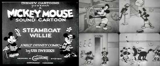
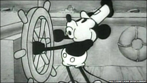
Video Friday: Steamboat Willie shoutOut on 28/9/12 by travis.lyle1 in peeps |
none yet |
0
show |
Classic animation: Disney's 'Steamboat Willie' (1928)Happy Friday! And if it's Friday, it must be Video Friday here at The Leap. Today we're going way, way back to the very dawn of animated cartoons, with a clip that marks Mickey Mouse, and his girlfriend Minnie's, first appearance on public screens with which the two mice made their splash into immortality with this, Disney's third-ever animated cartoon: Steamboat Willie. Many people claim this to be the very first that Disney’s studio put out: it’s not. That honour falls to a short clip named Plane Crazy, which also featured Mickey & Minnie, but failed to find a distributor and was thus not aired commercially until the 1960s. Mickey and Minnie - an early outingOne thing that's immediately obvious in Steamboat Willie is of course that Mickey and Minnie don't look quite the same as they've come to be known by modern audiences. No surprises there - this 7:43s short was first aired at Universal's Colony Theatre in 1928! On release it became hugely popular and paved the way for other animators' introduction to American, and subsequently worldwide, moving picture audiences. The major factor that created the short's amazing success was not necessarily the animation, but rather the fact this was one of the very first animated cartoons to feature sound - something crucial to the sketch, as the entire storyline contains musical skits by Mickey, Minnie and the rest of the characters.
A Disney time capsule from the dawn of animationDirected and produced by Walt Disney, who also did the voices, Steamboat Willie is a time capsule which takes the viewer back to the very start of what would become an entire industry which would revolutionise the way cartoons were consumed. Enjoy!
If you enjoyed this, you'll love our other featured Video Friday shorts - go here for more. |
|||
|
|
Video Friday #2: Dali + Disney = Destino shoutOut on 14/9/12 by travis.lyle1 in peeps |
none yet |
0
show |
Happy Friday to you, wherever you are, and welcome to the second ever Video Friday here on Springleap. Today we bring you a piece of animation so rare and so beautiful that it's earned the title of being one of the greatest pieces of animation of all time. It's a creation started in 1945 as the result of a collaboration between the godfather of Surrealism, the legendary Salvador Dali, and the godfather of animation, Walter E Disney. Due to various factors (including financial issues at Walt Disney Studios in the post-war era), the project was shelved in 1946, and lay in the Disney archive until 1999, when Walt's nephew Roy E. Disney unearthed the original and formed a team to resurrect the short film, which was finally released in 2003, 58 years after its inception. The result? Destino - the love story of Chronos, the personification of time, and a mortal woman falling in love. As a testament to the imagination of Dali and the skill of the Disney animators, this stands as one of the greatest creative enterprises of all time. Sit back, relax and prepare to be blown away:
If you enjoyed this, you'll love our other featured Video Friday shorts - go here for more. |
|||
|
|
Video Friday: 'La Linea' Episode #1 shoutOut on 16/11/12 by travis.lyle1 in peeps |
none yet |
0
show |
'La Linea' - simple animation at its bestOsvaldo Cavandoli's classic animation 'La Linea' was a series of 90 episodes which featured a line drawing of a man ('Mr La Linea', who's a rough facsimile of a human) who walks along a line, of which he's part. For anyone who watched TV between 1971 and 1990, chances are they recognise him immediately, as providing the light entertainment that was often featured between longer series - over the past 40 years, 'La Linea' has been screened in over 120 countries, on more than 500 television channels.
Mr La Linea: a moody little guy who has wild tantrumsAs Mr La Linea makes his way along his line, he encounters an endless array of problems - which he frequently turns to the illustrator to fix. La Linea doesn't speak any language known to man, though his gibberish is very descriptive in tone. The illustrator is always shown as a hand, with white pencil, who intervenes to correct mistakes or extend the line so Mr La Linea can continue on his way. He's a moody little guy, is La Linea, and often has wild tantrums (the series is Italian, and borrows much from the passionate gesticulation that Italians use) but equally is easy to please, and once his problems have been addressed, continues merrily on his way. As an exercise in how simple animation - this series was, after all, created using only a very basic stop-frame animation technique (and originally broadcast on the Italian channel RAI between 1971 and 1986) - La Linea remains a great example of the depth of humour and emotion that a simple line can communicate. But enough! (or 'Basta!' as La Linea might say) - take a look for yourself. And be prepared to burst out laughing! La Linea episode #1 (1971)
If you enjoyed this, you'll love our other featured Video Friday shorts - go here for more. |
|||
|
|
Crowdsourcing Designer Interview #7 shoutOut 1 week, 2 days ago by travis.lyle1 in wordUp |
none yet |
0
show |
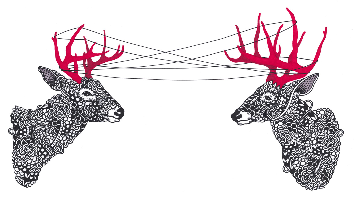
Crowdsourcing Designer Interview #7
In each of our Crowdsourcing Designer Report interviews here on Springleap, we dig deep to get the feedback from designers and illustrators from around the world on their experience of crowdsourced design platforms. We shoot them some questions, they respond, and you get the lowdown - everyone wins! In today's interview, we have the pleasure of interviewing Canadian illustrator Kirsten McCrae, who has a penchant for pop culture, politics and patterns!
Who are you? I'm Kirsten McCrea, an artist and the Founder and Director of Papirmasse, an affordable art subscription. Where do you live?
Between Toronto and Montreal, Canada.
Describe yourself - likes/ dislikes.
I love playing with the cross between popular and underground culture / patterning / politics / going out to see art shows. I dislike art that looks like an advertisement minus the product.
Which platforms do you use?
Threadless, Mintees, and Infectious.
How did you hear about them?
You don't have to travel far on the internet to learn about most of the above. In the case of Infectious, they contacted me after seeing my work on Artist A Day.
What do you love about crowdsourcing contests/ what don't you?
I am continually surprised by the sophisticated design taste of the public. I would say that generally, with crowdsourced design contests, the best stuff rises to the top.
Has it become a sustainable source of income?
No, I think that most successful artists rely on multiple sources of income. In my case, I was putting a lot of effort into it but eventually better opportunities came along from repeat clients. I now rarely submit to these types of websites, though I wouldn't be surprised if I started to again at some point in the future.
 What inspires you?
Working alongside other talented artists in the collective En Masse. My brilliant husband Jp King of Paper Pusher. Independent publishing. Parties.
Describe your design style?
A patterned and ornamental balance between extreme chaos and restrained tight lines.
Where did you study design?
I studied Fine Art (painting and drawing) at Concordia University in Montreal.
Which are your favorite designers and styles?
I think Sagmeister is everyone's favourite these days, so I will try to be less predictable and pick Stephen Heller and Jessica Hische.
What category of projects are your favorites? (e.g: packaging)
Gig posters and apparel.
What has been your favorite brief so far?
Every favourite brief is the one that says "Just do your thing. We trust you."
How can the experience be improved? For everything in general, the more people involved, the better.
Thanks to Kirsten for her time and insights!
Would you like to read more Crowdsource Designer Interviews? You can see the growing list of designers we're speaking to here.
|
|||

You need to be logged in to post blogs.