| shoutOut | last shoutBack | shoutBacks | |
|---|---|---|---|
| Around the world in five minutes shoutOut on 10/1/12 by Maike in peeps |
none yet |
0
show |
|
Hey there guys and girls While browsing the Internet and looking at a variety of photographs, I came across an amazing website – that of San Francisco based photographer, Kien Lam. Kien Lam wanted to discover the beautiful parts of the world. About a year ago, he decided to quit his job, buy a one-way plane ticket to London, and set off on his unforgettable backpacking journey. Kien’s main idea was to discover as many countries as possible, but also take quality time in each and every country to get a feeling of the atmosphere and to take the most perfect pictures. Another plan of his was to follow the sunshine around the world and only travel in one direction. He started out in London without much planning, and made it all the way via England to France, Thailand, Indonesia, Japan, Morocco, Argentina, Chile, Peru and back to the USA.
In numbers, he travelled through 17 countries in 343 Days and compiled 6237 photographs in an impressive time laps video called ‘Time is nothing’, which shows Kien’s trip around the world in 5 minutes.
It’s not only a breathtaking video, but also a big inspiration to plan your own trip around the world and inspire the photographer in you. Kien’s video and breathtaking photography clearly shows that he has an excellent feeling for that special moment that allows him to take the most perfect photographs, bringing across the exact atmosphere of the nature and surrounding that Kien was in, making the viewer and critics feel like they are transported right back to that time and place where Kien snapped the shot.
Combined with the background music by William Lam, the video compilation shows the most enjoyable photo series and makes you want to grab your backpack and start your own journey out into the beautiful world we live in right away. Chapeau to Kien Lam – you probably made yourself the biggest present in 2011 and shared this present with the world via your impressions of your journey in an epic and, without doubt, terrific video and incredible photographs. Miriam |
|||
|
|
NEW Springleap.com Design Submission Kit shoutOut on 6/1/12 by DuncanBoxie in wordUp |
none yet |
0
show |
Hi there all you Springleap designers! Here is some great news - We have just activated our New Springleap.com Submission Kit! This is very important news, because it will update you with everything you need to know about submitting your designs to contests on our platform. We are pleased to announce that this is a much slicker version than the original and we are sure that you will find it very ‘user friendly’. Our in-house designer has really gone the extra mile to ensure that it is visually appealing and simple to follow. Thanks Robin!
In order to download the New Springleap.com Submission Kit, please go to our SUBMIT PAGE. One of the most important aspects of the new submission kit is the fact that it shows our new list of t-shirt colours. Please get acquainted with the new list of colours because it will save you a lot of time and effort in the long run. There is nothing more annoying than creating a design, only to have it sent back under ‘Need Work’ and then find that it doesn’t suit any of the official colours. If you are having absolutely any problems with the New Springleap.com Submission Kit, or don’t understand something, please drop me an email at: Duncan [at] springleap [dot] com.
We are always happy to get feedback from our community. Let us know what you think…and most of all ENJOY.
|
|||
|
|
Marmite design contest - vote on awesome t-shirt designs shoutOut on 5/1/12 by DuncanBoxie in wordUp |
none yet |
0
show |
Spread it on!!!
‘Spread the Marmite love’ is looking good, guys and girls.
Thank you so much to all our fantastic designers who sent through their submissions.
Remember to get your friends and family involved by asking them to vote for your designs. If you have as yet not voted for your favourite designs please surf across to the VOTE PAGE and show these awesome designers some love! The submissions for the Marmite t-shirt design contest are going to rock your world. Here are a few more top-notch Marmite designs to get you even more excited.
|
|||
|
|
NINJABREADBOY – T-shirt packaging design shoutOut on 4/1/12 by in wordUp |
none yet |
0
show |
Hi there one and all, It’s always great to see awesome South African designers expanding their range in new and exciting ways! This time around it’s Richard Duncan Moir (AKA: NINJABREADBOY) who has taken his awesome quirky characters into the realm of not only t-shirt design, but also packaging design. What I like about this t-shirt tube is the fact that it is intended to be re-useable. That means it is not simply some lame-ass container that will be instantly chucked out and end up as land-fill, or a rather uncomfortable adornment for some unlucky creature, but rather as a funky receptacle for…well basically anything that fits.
His super cool t-shirt design entitled ‘Jy sal’ie vir my sê nie!’ has a central character that looks like the dodgiest street thug you could ever have the displeasure of meeting in a dark alley! I take my hat off to NINJABREADBOY for coming up with a very visually appealing character design. His minimalistic colour jobs have a very striking energy to them which work well with a tee canvas. This is a limited edition tee design, so if you would like to check it out and at the same time scope out more of NINJABREADBOY’s uber radical character design, please cruise across to his Behance page. Great work dude, I’m sure we will see more of your stuff soon enough! Duncan |
|||
|
|
Nike – Ronaldo’s camouflage boots shoutOut on 3/1/12 by in wordUp |
none yet |
0
show |
First off, when I say camouflage I don’t mean that Ronaldo will be running around the football pitch in army camo flavoured boots, rather that his boots are a new technology aimed at disguising the movements of his feet….that kinda camouflage, hehe.
In essence the new Nike CR Mercurial Vapor Superfly III gives the defender the impression that his feet are going to move in the opposite direction than they actually appear to be.
It seems that the Nike team has taken what it has learnt from the World Cup and incorporated visual tomfoolery to confuse its enemies. During the World Cup they used an orange detail which was used for identifying other teammate’s feet when they were in the thick of it! This was a pretty cool feature if you consider how difficult it is to spot players in your peripheral when you are moving at pace, blinded by sweat and adrenaline is pumping through your veins. This is of course double-edged because your enemies will see you coming as well! The Nike CR Mercurial Vapor Superfly III has gone the other route though and focussed its design on confusing an attacker that is already in close proximity. The array of crossed pinstriped lines and thicker stripes all look very different depending on what side of the wearer you are on. The asymmetrical appearance of the design comes together in such a way that it confuses the eye and makes quick judgements that much more difficult to assess. This raises the question: just how fair is it to have a boot that causes an optical illusion of movement? Together in such a way that it confuses the eye and makes quick judgements that much more difficult to assess.
In my opinion if one team is wearing them, then the other team should as well. Teams should all be on an equal ‘playing field’ and using tricks like this seems rather underhanded.
So, in your opinion, do you feel that this is fair to the other teams…or do you feel that all is fair in love and WAR….and let’s be honest professional football certainly qualifies as war, hehe. Game on :) Duncan |
|||
|
|
Moleskine design shoutOut on 30/12/11 by in wordUp |
none yet |
0
show |
Creativity on the move!
We absolutely love the Moleskine notebooks here at Springleap.com
Moleskine are very well known for making high-quality, uber practical notebooks, diaries and sketchbooks. The Italian made Moleskine has in recent times become a bit of a sub-culture of awesomeness for designers the world over.
You will find more and more amazing Moleskine artwork popping up in the near future!
Take a look at some awesome Moleskine artwork below:
Ok, so this may sound like a bit of a ‘trendy art suck’…that being all the ‘cool’ designers are doing it. LOVE IT!! Duncan |
|||
|
|
The Sick Leaves - New album 'Breaking Away' shoutOut on 29/12/11 by in wordUp |
none yet |
0
show |
Most of you already know about The Sick Leaves, our rocking brand ambassadors, but it’s time for a little update on what they’ve been up to recently. In April, Duncan posted about their newly launched and simply amazing website – www.thesickleaves.com . Now we bring you some more news about what the band has been up to this year - front-man, Eksteen Jacobsz, has been busy as a bee. The Sick Leaves are gearing up for the digital release of their long awaited fourth album Breaking Away on 23 January 2012. Throughout the past year, Eksteen wrote all the songs for Breaking Away and recorded the vocals, guitars and bass. The result of this hard work is a smashing new album with eight mind blowing tracks that promise to be like an island holiday for your ears. Even though the music should be enough to convince anyone to buy this album, the artwork used for the album cover definitely adds something too. It features a photograph of space shuttle Endeavour blasting off from Kennedy Space centre. Just by looking at it one can feel the power and energy of the music that it represents for this fourth release, and clearly fits the theme of 'Breaking Away', just like launching off into space. Eksteen said the following about the journey of recording this album: “Breaking Away is for me a culmination of the past 7 years’ experience. I've gained through recording music, playing it live and living. For me it is the most enjoyable Sick Leaves album to listen to and also the most representative of the sound I am after. It also closes a chapter in my musical career,,as I feel that on the next album I will go for a totally different direction and feel than the previous four.“ Catfights and bushes is the first radio single off the new album and FREE to download straight off The Sick Leaves’ website and their Band Camp profile. I’ve downloaded the single and am blown away by the sound. I think this single is a great way to advertise the new album, give you a little taste of what’s coming, and give it a real kick-start to its sure-to-come success. Have a look, download ‘Catfights and bushes’ for free, and let me know what you think. I cannot wait for the digital release in January! Stay tuned for the news. You guys rock! Miriam |
|||
|
|
Geek Design shoutOut on 28/12/11 by in wordUp |
none yet |
0
show |
Geek design has become a huge part of our daily lives. The lifestyle of the geek has become as cool as any of the well known jock/trendy groups and every year it gains a bigger more solid following. Indeed the geek shall inherit the Earth!
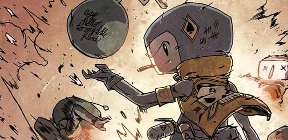
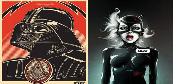
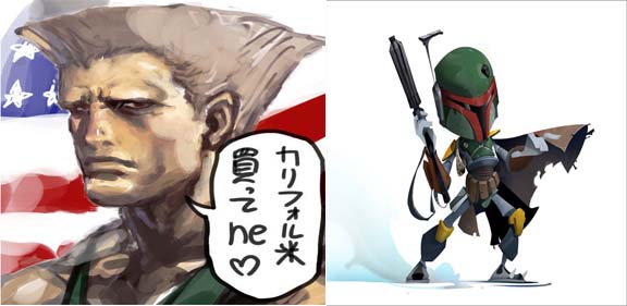
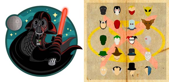
Perhaps the key reason for this is the awesomeness that is the internet. Geek design has been scattered all through the web at mind-bending speeds by the legions of geeks who hold it dear. Television series like Big Bang Theory have also dragged the name of ‘geek’ out of the mud, brushed it off and placed it at the top of the cool throne. This series in-particular has also spurred a massive commercial opportunity for geek design. Millions of fans around the world are obsessed with the super cool geek t-shirts that the main characters wear and in its wake a plethora of ‘geek couture’ online stores have sprouted up….they rock!!! Geek design is no longer a derogatory term, but instead a term of endearment among an ever growing legion of faithful followers. Here is a groovy burst of geek design power to liven up your day.
Do yourself a favour, GO GEEK, or become a dying breed like the ‘so not cool jocks’. Duncan |
|||
| It's all about Camouflage shoutOut on 20/12/11 by Maike in peeps |
none yet |
0
show |
|
Camouflage – probably the first thing you think of when someone mentions this word, is the currently out of fashion look inspired by the military. One easily forgets the real origin and purpose of Camouflage. Camouflage is the method of hiding in ominous situations and a lot of animals make good use of this effect. I came across this blog post on web Urbanist the other day, which inspired me to introduce you to camouflage in a new light – as part of a creative concept. Apart from appearing as a fact of nature or even in fashion, camouflage can be a great theme to inspire you to create amazing artwork. Two prominent artists that like to use camouflage in their work are Desiree Palmen and Liu Bolin. Both are talented artists and photographers who paint or colour in suits to match them to certain scenes or surroundings, and then photograph the camouflaged scene to end up with beautiful photographic pieces of art. The interesting thing is that even though they start out with the same idea, the results are usually very different .
Desiree Palmen is a Dutch artist and seemingly more inspired by European motifs. She likes to walk through the streets to get her inspiration and then simply starts painting a perfectly camouflaged suit. With great attention to detail, she finishes up the suit in such a way that they are virtually hidden in the final photographs, making for very interesting artworks.
Compared to Desiree Palmen’s work, Liu Bolin likes to find his inspiration in his Chinese surroundings and is a real perfectionist. He puts a lot of effort into the creation of every single photograph, which sometimes takes him up to 10 hours to get just right.
These two artists provide great examples of how artists can take their creative inspirations from nature.
It’s yet another way in which we can express ourselves. Isn’t creativity a wonderful thing!?
(Please note: this post is written by Miriam, but posted by Maike due to technical issues) |
|||
|
|
Banksy new designs shoutOut on 22/12/11 by in peeps |
none yet |
0
show |
BAM! Banksy strikes again!!! Banksy, for those of you who are not familiar with the world most well known graffiti ‘freedom fighter’ (some say terrorist…lol), is a stencil graffiti artist who is famous for creating thought provoking urban graffiti art. It more often than not has a heavy political or social tone.
His expertly executed social commentary has been the bane of English officials and the police ‘Top Brass’ for many moons, not just because his messages hit home with a kick square to their ‘crown jewels’ but also because nobody has been able to find out his true identity. Banksy is a graffiti phantom, a spray can wielding spectre of truth….he is downright invisible clarity!!! This time around Banksy has hit the central London metropolitan hub with a series of pertinent thought-provoking designs which touch on subjects such as Black Friday, the oppressive ‘rat race’ lifestyle, as well as the reality of the general public being under constant surveillance by the ‘Man’.
This is such an interesting graffiti designer to discuss because everybody has their opinion on how he operates and of course the true merit of his work and message. Quite a while back I wrote a blog about a documentary that tackled the question of how exactly you would go about selling a Banksy design (he is wanted by the police after all, hehe)…very interesting stuff! What do you think of these awesome new Banksy designs, I would love to hear your opinion! Run Banksy…RUN!!! Duncan |
|||

You need to be logged in to post blogs.