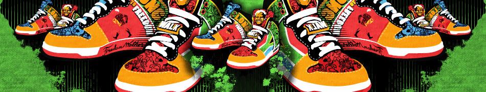


Vector design tutorialshoutOut on 20/10/10 by DuncanBoxie in peeps |
|
|
Making a vector image is easy as pie! Many people argue that constructing vector images in Photoshop is more difficult than other programs, such as Illustrator, which is more specific for the task. In Adobe Photoshop the most important tool to master is undoubtedly the “pen tool”. The path selection tool is what you will use if you want to move around an entire path selection from one point on the X & Y axis to another. Ok lets take this step by step shall we: 1. Open up the image you have scanned or have found online by clicking FILE and then OPEN. Now select the desired image (jpg for example) and it will open up on your Photoshop dashboard set on its own layer. 2. Now double click on the layer that the image is now sitting on. The layer breakdown will usually be found on the right hand side of your screen (depending on how you laid out your PS dashboard). 3. Before we move on make a duplicate of the original image (whatever you have now named it). If you will be using PS7 you must create a “layer set” in order to retain all of your separated objects. You can do this by double clicking on “Set 1” (default name) which you will find at the bottom of the “layers palette” and change it to an appropriate name. The name for the sake of this exercise will be called “copy”. Now its time to get acquainted with the PEN TOOL (hallowed be thy name). 1. First off select the foreground colour of your design by clicking on the darkest part of your design/image using the EYEDROPPER TOOL. 2. Select the PEN TOOL and now click on the SHAPE LAYERS option which will be found on the OPTIONS TOOLBAR. 3. Add anchor points to the region you want to select. 4. Go around the outline of the entire image or portion you wish to select and finally make sure that your final node that gets added meets up with the first one, it will then terminate in a complete shape. 5. Hide the top layer (Copy in this case) in order to see what the node shape looks like beneath. Time to convert those points. 1. Turn the copy layer back on and choose the CONVERT ANCHOR POINT and use it to start rounding off those areas that have curves. 2. Select the SHAPE2 layer (you will find this in the Layers Palette). 3. The idea here is to get as close a wrap as possible. This will take time and practice, but its pretty easy to master. If you feel that an image is made up of too many nodes, simply delete them for smoother curves by using the DELETE ANCHOR POINT tool. 4. Duplicated the layer named ‘Shape 2’ layer, in order to create a layer called Shape 2 copy. Tweak its anchor points in order to wrap around the images main colour. Select the thumbnail layer preview of the layer that needs to be colour ‘picked’. Click on the Thumbnail Preview of that layer to get the ‘Colour Picker’, and change the black to the dominant colour. 5. Turn the ‘theimage copy’ (black) back on and hide the ‘Shape 2 copy’ layer (the blue one). 6. Now choose the PEN TOOL and make sure that the SUBTRACT FROM AREA SHAPE is switched on, you will find this on the OPTIONS BAR. 1. Ok, so hide away the ‘Shape2 copy’ layer (Layers Palette). Select your Shape 2 layer which you will find on the Layers palette. Now begin to trace the area that you require. 2. You can give the same affect on other similar elements without needing to add a new layer. Hold down Ctrl + Alt and then click and drag the particular subtraction path to make the duplication. Repeat this as many times as required. Now set the duplicates to where they should be and tweak the anchor points. Adding a bit more detail. 1. You can now select pre-created shapes, such as circles, by using the ELLIPSE TOOL (toolbar). Do your first shape and then press the ‘Shift’ key and draw in as many secondary shapes as you require. 2. In order to define the shape with more accuracy hold down Ctrl + click on the new shape and follow this by right clicking on each individual shape and select ‘Free Transform Path’. 3. Now choose Distort in order to alter the corner points until they fit exactly where desired. Repeat this process as many times as is necessary. 4. Create finer lines of your design by selecting the PEN TOOL, but now select PATHS on the Options bar. Make a new layer, and name it something appropriate like ‘Lines or details’. Make sure that this layer is at the top of the layer order or it will not appear. NB: The only two effects that can be used are halftones and gradients. D. |
|
|
I’m a newbee in photoshop and sure this’ll be a lot helpful, thanks Duncan!!!
shoutBack on 2/12/10 by urxmun
|
|
|
Love creating vexels of my friends, thanks for this post Duncan :)
shoutBack on 3/11/10 by amyabrahams
|

Sharing is caring
(don’t keep it all inside. You might explode)