


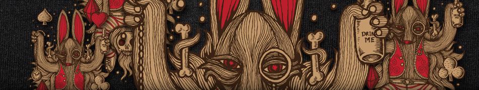
Title:
Evolution of the console
Design by:
dylanwyndhamjonesWords by the designer:
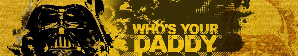
The evolution of the console, starting with the Atari, ending with the ps3.
Decided to use a pattern in the end, cause one straight line was a bit boring.
4 colours
Add your comment...
You need to be logged in to post shoutBacks.
shoutbacks
|
Hey everyone, thanks for the comments and suggestions. I’ll keep it in mind for future projects
shoutBack on 16/7/10 by dylanwyndhamjones
|
|
|
this is SICK! but that grey is killing it for me. y dnt u try it on black? if its allowed
shoutBack on 14/7/10 by INYOURFACE
|
|
|
I do love this T-shirt. Colours work very well. However, it’s a bit repetitive without purpose, which I think would look great on the entire garment but is not feasible in this case.
shoutBack on 13/7/10 by cloMO
|
|
|
Freaking rad!!! Love this all the wayyyyy I like this version - but would like it with the changes Duncan suggested as well Enter them again
shoutBack on 12/7/10 by claudiosworld
|
|
|
Like the design.
shoutBack on 9/7/10 by DuncanBoxie
|
|

Add your comments...
|
Hey everyone, thanks for the comments and suggestions. I’ll keep it in mind for future projects
shoutBack on 16/7/10 by dylanwyndhamjones
|
|
|
this is SICK! but that grey is killing it for me. y dnt u try it on black? if its allowed
shoutBack on 14/7/10 by INYOURFACE
|
|
|
I do love this T-shirt. Colours work very well. However, it’s a bit repetitive without purpose, which I think would look great on the entire garment but is not feasible in this case.
shoutBack on 13/7/10 by cloMO
|
more...
Like this design?
Share it on your favourite social network...
Submit your own tshirt design!
think U have a Tshirt design that EVERYONE will LOVE & want 2 wear? If your thinking is right you'll walk away with HUGE CASH & PRIZES.
For your chance @ Fame & Fortune...
Design a tshirt
Own a Clothes Shop? Buy @ Wholesale?