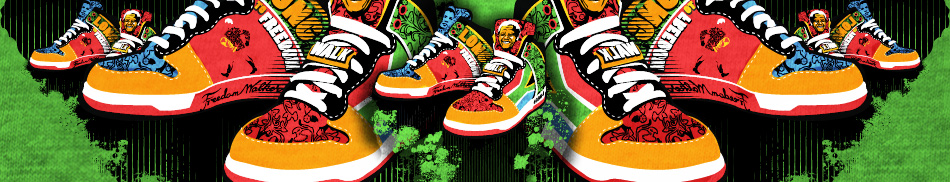
OH MY FRIGGIN WORD, GUYS! Thank you all so much - this win means so much to me! AWESOME! I spent hours on this design - and from the feedback I've been receiving I can see everyone loves it! THANK YOU THANK YOU THANK YOU!
@ParanoidAndroid - don't get your criticism, bud!? I'm all for it, but at least the crit should make sense!? Did you not see the word POWER or the social networking icons composited into the design!? Thanks for feedback none the less...
I might have sounded pissed-off in my previous shoutback - wasn't my intention. I'm just worried that the focus of this competition is out when worrying about trademark implications. The focus is on creative design, and designs can be altered to suit any brand. That's just my opinion.
Thanks for the crits though, I appreciate.
I find feedback about brand identity a bit puzzling at this stage. Sure, be careful - but don't limit yourself in terms of creativity. The idea with this competition was to create striking, original designs, and I believe that is what I've done here.
BTW: I've taken a look at MR PRICE's website, and see only REDCAP as a registered trademark. Another thing that puzzles me is the design elements pack we were given as entrants to this competition - more than one of those elements appear as graphics on the MR PRICE website. Pretty strange that we're debating brand ethics, when the graphic elements pack I was supplied with as an entrant (and told to strictly adhere to) contains graphic elements that appear on the same retail competitor's website about which I am being cross-examined...
Valid point Tokyo - but if design discrimination applies to something as basic as colour (or the suggestion thereof), I guess it's very hard to create something unique these days... My hope in this shirt's case is that we can curb stereotypes in fashion retail - red is a great addition to any wardrobe (no matter where you shop!)


 and is 827,567,873 seconds young

OH MY FRIGGIN WORD, GUYS! Thank you all so much - this win means so much to me! AWESOME! I spent hours on this design - and from the feedback I've been receiving I can see everyone loves it! THANK YOU THANK YOU THANK YOU!
@ParanoidAndroid - I guess everyone is entitled to their own opinion. Thanks.
@ParanoidAndroid - don't get your criticism, bud!? I'm all for it, but at least the crit should make sense!? Did you not see the word POWER or the social networking icons composited into the design!? Thanks for feedback none the less...
Thanks for approving this one, team!
Thanks!
Cool!
Sheesh peeps - you make a guy blush! Thank you!
Aww schucks - thanks guys! Its my favourite design out of my five submissions, I must admit!
Thanks Guys!
I might have sounded pissed-off in my previous shoutback - wasn't my intention. I'm just worried that the focus of this competition is out when worrying about trademark implications. The focus is on creative design, and designs can be altered to suit any brand. That's just my opinion. Thanks for the crits though, I appreciate.
I find feedback about brand identity a bit puzzling at this stage. Sure, be careful - but don't limit yourself in terms of creativity. The idea with this competition was to create striking, original designs, and I believe that is what I've done here. BTW: I've taken a look at MR PRICE's website, and see only REDCAP as a registered trademark. Another thing that puzzles me is the design elements pack we were given as entrants to this competition - more than one of those elements appear as graphics on the MR PRICE website. Pretty strange that we're debating brand ethics, when the graphic elements pack I was supplied with as an entrant (and told to strictly adhere to) contains graphic elements that appear on the same retail competitor's website about which I am being cross-examined...
Valid point Tokyo - but if design discrimination applies to something as basic as colour (or the suggestion thereof), I guess it's very hard to create something unique these days... My hope in this shirt's case is that we can curb stereotypes in fashion retail - red is a great addition to any wardrobe (no matter where you shop!)
Thanks for the compliments - the idea with this design was strictly to appeal to the masses. A t-shirt anyone would appreciate...
This is my favorite of your designs - fashionable and wearable - would work on any colour base...
Designs that are too balanced are mostly frowned upon - that's the reason for one or two off-balance elements in this design...