


Balanced t-shirt designshoutOut on 30/6/11 by DuncanBoxie in peeps |
|
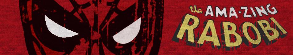
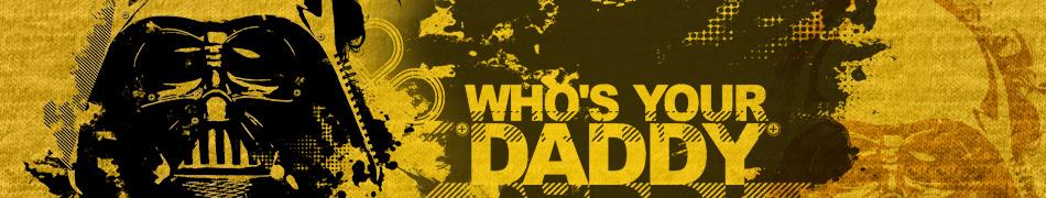
Hi there all you designers out there. Creating a balanced t-shirt design is not easy! You may be the ultimate design guru who can draw practically anything and have a brilliant sense of color , but if you can’t properly balance out your design on your ‘canvas’ of choice, it’s never going to reach its full potential . In more simplistic t-shirt designs designers use hard edges shapes to complete their design, like the common ‘box’ prints, or circle prints. Sorry to say, but unless you are creating a band-poster tee or a logo design these simple shapes are a tad boring for me personally. You need to break away from simple shapes and let your creativity start to work with the space provided. Techniques like adding subtle gradients and making use of negative space can really work the charm. You need to think to yourself how you can make your design look more ‘at one’ with the t-shirt canvas. While the above statement may seem a bit ‘Crouching tiger, hidden Wacom’ you need to seriously tap into your more technical side and think like an engineer…which is not always easy for right-side-brain users such as artists. Take a look at these two examples of superb balance from 2 of our respected Springleap artists:
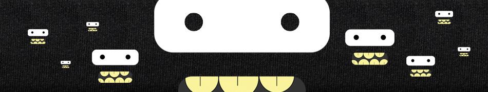
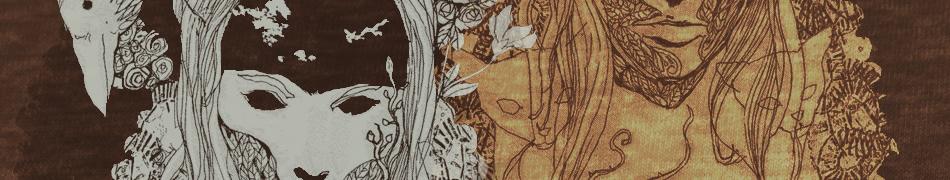
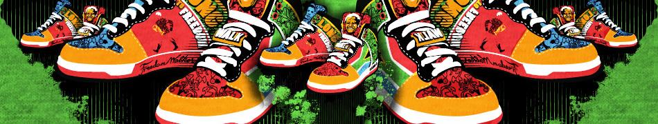
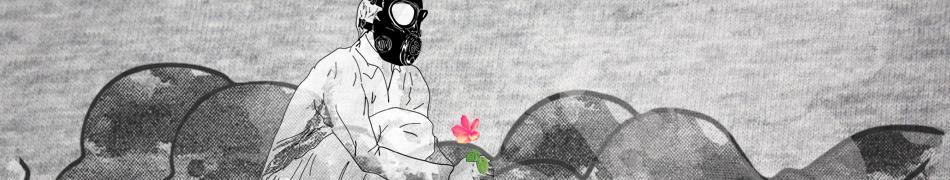
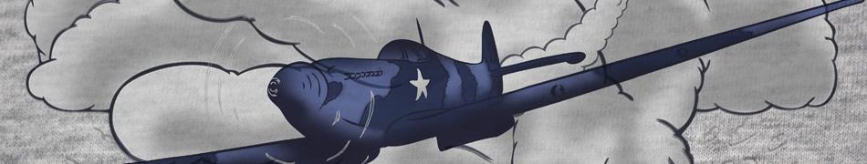
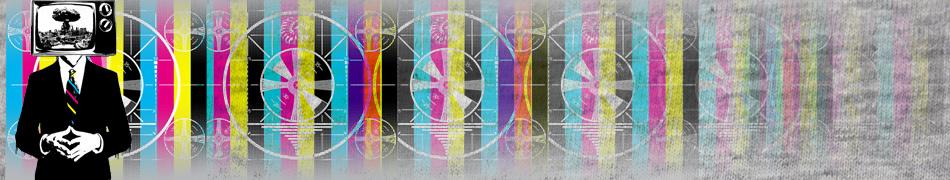
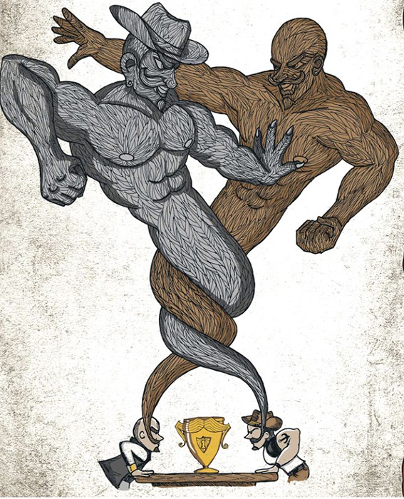
Epic Battle! By Dewedhe is a great example of flow and large-size that still makes good use of the t-shirt without bombarding your eyeballs. Who’s your daddy? is another awesome example of using space wisely. Now I could ramble on for days about properly balanced t-shirt design, but I have found one seriously awesome tutorial on the amazing Computerarts website that will give you some mega-help with your design. It sure as Hades helped me! Do you designers have any cool tips for the community that can help them with placement? D |
|
Add your comment...
You need to be logged in to post shoutBacks.
|
Jared rocks, big fan of his works.
shoutBack on 30/6/11 by MEKAZOO
|

Submit your own tshirt design!
think U have a Tshirt design that EVERYONE will LOVE & want 2 wear? If your thinking is right you'll walk away with HUGE CASH & PRIZES.
For your chance @ Fame & Fortune...
Design a tshirt
Own a Clothes Shop? Buy @ Wholesale?