
| shoutOut | last shoutBack | shoutBacks | ||||||||
|---|---|---|---|---|---|---|---|---|---|---|
|
|
King of Comments, Queen of Quotes - WINNERS shoutOut on 5/4/11 by DuncanBoxie in wordUp | 3 weeks, 4 days ago by Valesidecc | 7
show |
|||||||
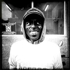
OCTOBER 2011 WINNER – WILBUR LIKE SMITH ……………………….. Monsoon, Assegai, River God?…..nope wrong kinda Wilbur! All hail our October King of Comments, Wilbur Like Smith! We are happy to announce a winner that really impressed us with his positive nature. Considering that he made lots of comments of our Positive Heroes competition entries we feel that he is definitely the right choice.
Wilbur Like Smith is one of those guys who gets involved and helps build the confidence of designers! Just have a lookie at his comments and you will begin to see what we look for in a King:
“This is also a great pattern concept. Wanted to say that the logo could have been one of the four blocks, but I like the off-balance composition, nice work” “I really like the image, but it's a bit comical for the topic :)”
You see what I mean? He is helpful and very good-natured in how he gets his opinion across. This is what our King had to say when he received the crown: This is so orsm!!1! That's why I love Springleap!! You guys rock, apart from not just having great designs, fantastic print work, Springleap has gone and created a sense of community as well. Winning this reminded me of something I read the other day, the words are by Feenix (designer of the Goodjoe logo) - "Everyday throughout the nation, ordinary people are doing small things, acts of kindness that make a huge difference in the lives of others and continue to inspire and provide hope to so many." To all the designers, keep up the good work and good luck. Springleap's all about the designs and real people. (I still have to submit my first design) Thanks again to Wilbur Like Smith. It was tremendous to see your comments coming through and we know we will see more and more of you in the future.
We appreciate all your hard work. ……………………….. SEPTEMBER 2011 WINNER – UNCLEHANI ……………………….. NICE ONE! Time to crown our King of Comments for September! Springleap sends out a big highfive to UncleHani for all of his contributions to the competition this month. It is great to see a Leaper who takes the time to get involved and give some feedback for our design submissions.
One of the best things about UncleHani is the fact that he is very to the point! In many cases this is the most effective way to help designers out. They don’t want to hear false congratulatory nonsense, they want somebody to call a spade-a-spade and help them grow. I liked these comments below most. The reason being he is so friendly and supportive of the designers work in both cases:
“Loveliest design, I like the idea of the baby, attached to the plus sign, big ups!”
He also made me laugh when he made a typo on one of his comments and then quickly ‘rectified’ his mistake: Yup don’t wanna be giving the designers the wrong idea there, hehehe. This is what UncleHani had to say about why he loves Springleap: I love Springleap because it allows you to express yourself in a artistic manner, it keeps you out of trouble like drugs, crime etc. and I am thankful
to God for the minds that started the Springleap campaign.
UncleHani has sent through so many great designs to our competition. It has been really amazing watching his style develop over the past few months. His latest submission Sesame Street meets Twilight was a really fun design, which had us all in stitches here at the HQ. Thanks again UncleHani…we know we will see you around! ……………………….. AUGUST 2011 WINNER – EFFIN’SWEET ……………………….. WINNER WINNER WINNER! SUPER CONGRATS go out to Effin’Sweet for winning our King of Comments competition for August . What we love about Effin’Sweet is that he is not at all condescending when he makes his comments about designs. He is helpful and gives suggestions for placement, but is never cocky or elitist when he does so.
It’s cool that he is always mega chilled and friendly!
Here are a few recent comments from Effin’Sweet which I felt illustrated his style of commenting: 1. “I quite like this one...out of the three I like the red version best, but I also like the red and blue version, I think that the randomness of colour becomes a bit busy, maybe try doing the Rev counter Red, speedo white and fuel gauge side blue.” 2. “Haha...cool glasses. If you break up some of the solid black it could look really good.” 3. “Nicely Done! I dunno why but I’m feeling like a slogan of sorts could have gone well at the bottom of the illustration.” You see what I mean? Zero aggression or negativity....just useful and happy comments. Effin’Sweet most recently collaborated with none other than local South African design guru, CHUCKY, to put together one of the most memorable and unique designs from the LEXUS ‘CT 200h’ competition. There were so many people at the Springleap HQ who felt that this one was a winner. To find out more about Effin'Sweet why not check him out on his Twitter page.
Thanks to Effin’Sweet for all the positive energy, we LOVE IT!!! ……………………….. JULY 2011 WINNER – MATSANNI ……………………….. Weeeee have a WINNER! Well done to Sannidya (AKA: Matsanni ) for scooping our King of Comments prize for July . We are always impressed with the awesome contributions this Springleaper adds to the website. Not only does he always have a positive word to say about a design, but he is also very helpful with insights that can help designers improve their work. We often talk about the “balance” of the ‘perfect critique’ and how if you are too negative you could scare off designers , or if you are too positive, the designer never learns from their mistakes.
Matsanni has his comments down to a fine art and always seems to leave the designers informed and confident about what they produce. Take these examples of his comments below for instance, if I was the designer I would be so amped about my design: 1. “BADASS character , I love the firm line, nice coloring and the distressed effect. I can’t imagine how cool I am when I wear this tee on the summer and I will wear the sunglasses, I don’t wanna have too much eyes LOL well done”
2. “Heya mr.Barmalisi See what I mean? He is open and friendly , makes you feel good about your design, but also shares insights in a controlled manner. Many of you will already know Matsanni from his amazing winning design No place for Hubris! Which blew away the competition in the April 1 OPEN THEME compo. So, not just a talented designer , but a helpful member of our community too! You are a legend Matsanni, thanks for your contributions . You are most certainly the deserving winner of our King of Comments for July HIGH FIVE ……………………….. JUNE 2011 WINNER – BLEET ……………………….. Once again it is time to crown our monthly King of Comments . Congratulations go out to Warren (AKA: Bleet) for his contributions and genuine feedback! The designers he has helped will no doubt grow from his advice and comments.
What we like most about Bleet’s comments is the fact that they are critical without coming across as harsh …which is paramount to helping improve designers, without crushing their spirits altogether!
Bleet uses a bit of humour to get his message across, for example he said, “Reminds me of snakes and ladders, would have been cool if u connected the 2. Snakes and ladders with the dude, ok that concept is free, next one you will have to pay ;) “, haha.
Bleet is already earning himself huge praise from the Springleap community and his skills seem to be growing at an exponential rate. When you consider how good he is it is abundantly clear that he will very soon have his first Springleap victory under his belt.
It’s one of those ‘It’s not if he will win, but WHEN’ kind of a situations. Thanks again for the great comments Bleet, enjoy your prize ;) ……………………….. MAY 2011 WINNER – IZZICANE ……………………….. May has been another amazing month here at Springleap, both of our Open Theme winners were absolutely brilliant and we announced the winner of the Stepdog competition.
We have had an equally impressive amount of informative feedback and comments from the community.
The great news is that we have our very first Queen of Comments. What I really like about our South African winner is that she may not be a designer, but she is passionate about good design. Izzicane says, “I’m not a designer or arty person but I love creativity and a good shirt :)!”
Not only did Izzicane get involved with most of the submissions up for vote, but she also tweeted on just about every design too. Izzicane had loads of insightful comments, but this is my favorite: “Great design Hanno, the layer affect really works well. I feel that the design or logo just needs a bit more colour though as it has a lot of white open space, which could be a bit distracting. Maybe if you put some more shading into the moon or dirty the white up a bit? Maybe consider enlarging the logo a bit as well to give it a bit more attention and like Maike said maybe place it closer to the moon. I love the hand drawn feel and I think you nailed the eerie and sombre feel you where going for, over a great piece of art.”
I like that she compliments the design, gives constructive criticism , but at the same time isn’t patronizing . Thanks again to Elzaan and well done! Find out more about the King of Comments, Queen of Quotes competitions. ……………………….. APRIL 2011 WINNER – SIMON ……………………….. Greetings one and all.
First off, thanks to the community for their awesome feedback with the April competitions.
It is usually a very difficult, or at least a close race, when it comes to making our choice. Huge congrats and thanks go out to Simon for his comments which undoubtedly helped raise our designers A-game . Here is one of his comments that I really enjoyed: Hey, you know what, I am a GUY and I love the pink, so bleh! This gives me the feeling of a vintage cake shop, I don’t know why, but I like cake so hey, what the hell! This is one of those shirts that I reckon would be quite “fashionable” when worn with some nice dark faded jeans. It has a ‘vintageness’ to it, and that seems fairly popular these days. I think the way you’ve used the typography as the “chair” is a clever touch. Because she is sitting down, one would naturally be drawn to the “chair”, in this case your words. Looking at your design preview on white, I think the design has been placed too large. Another thought, I could see this working without the background pink and it’s containing border, so if the girl just sat on the words to the left or right of the bottom area of the shirt I reckon that could work too? Agree?
For those of you who have been Springleapers for a long time , you will definitely recognise this talented designer’s work. Perhaps one of the greatest ‘designers designs’ ever to grace Springleap, came from this man. How long is a piece of String? , feature on the right hand side , is another simple yet effective design that helped raise Springleaps cred back in the day. Thanks again to Simon for being a true all-around Springleaper , who adds value to our platform and community. Enjoy your prize ;) ……………………….. MARCH 2011 WINNER – ACME ……………………….. Hi there friends . It’s time to announce our King of Comments winner for MARCH 2011! It has been really fantastic to see so many people getting involved and sending through positive feedback to our designers. We would like to send a big THANK YOU and CONGRATULATIONS to our winner acme ! This designer had plenty of helpful hints for our community of designers, whilst still being a nice guy ;) Take a look at two of his comments below. This is just the sort of thing we are looking for from the King of Comments, Queen of Quotes winner: “I think the concentric circles make it a bit stiff overall, specifically the outer ones . It could loosen a bit then it would be really great. The fist and electric shocks are the most powerful elements of this design so that should be the focus” “That unicorn is EPIC! Would have loved to see more of the unicorn and clouds without the geometric elements though”
Acme is already very well known on Springleap!
You will surely know his hilarious Mule Bear and beach-arific Big Wave Challenge submissions.
Most recently acme’s Happy Dolphin design made a huge impression on our March 1 OPEN THEME.
Thanks again acme, we hope you enjoy your prizes .
So, who will be our King of Comments, Queen of Quotes winner for April? SL team. ………………………..
|
||||||||||
|
|
WINNING DESIGN - Still Life with Mustache and Guns - Kingslip shoutOut 3 weeks, 6 days ago by DuncanBoxie in peeps |
none yet |
0
show |
|||||||
HeeeeeeHaaaaaawww…. Howdy Pardner! Congratulations go out to our October 2 Open Theme contest winner, Kingslip.
Once again this brilliant Springleap design veteran is back with a mega-impactful submission. His latest winning design, Still Life with Mustache and Guns, is gonna bring out the fearless gunman in you!
This is the most epic design that could have possibly won for this time of the year.
|
||||||||||
none yet
show
Greetings all you designers out there,
Times are hard!
Of course I don’t need to tell you that. With the economic upheavals of recent times it’s becoming harder and harder for individuals, from any professional sector, to make the money they truly deserve.
These problems affect the freelance designers maybe even more than those who are sitting in full-time employment. Sure the full-timers more often than not are making less money, but it’s far less frightening than being pulled this-way-and-that by companies who are looking to get the cheapest deal out of you.
It’s all cool that a company looks for the best deal, but where does it end? Crippling the design industry and demoralizing designers who just want to earn what they are worth, is not the way forward.
The designers that have just stepped out of college are in for a shock when they come face-to-face with hard core business peeps, that’s just a given.
In order to survive the recession you need to keep a level head and never let yourself stagnate....keep moving!
However, it’s not just the ‘noobie designers’ that are being taken for a ride!
That’s right all you design gurus out there, don’t feel bad, some of the biggest names in the industry are having to bow to pressure in order to survive.
Akira Yasuda, AKA: Akiman, who is best known for his breathtaking character design for a myriad of Capcom works, which includes Street Fighter II and III, Breath of Fire and Darkstalkers, recently found this out the hard way!
Akira was recently asked by Japanese based developer/publisher Enterbrain to create 6 of his amazing characters for a measly 8,000 yen each….that works out to like $100 a character.
For somebody of his calibre that is a ridiculous insult! These were characters that would be used as central elements for a game project. What irks me is that Enterbrain are not a small company. They know the industry standards and definitely seem to have manipulated a talented designer because he “has no money”.
Yasuda would normally charge around US$1,300 for each character, but decided that he would take the job for US$1,000, on condition that he would get to do more with the project. I don’t know about you guys but these kinds of arrangements usually lead to disaster. The whole ‘foot in the door’ project is often a tasty looking ‘carrot’ dangling in front of you when you are desperate for work.
So, as I said….everybody is feeling the pinch…even legends!
Akiman is simply doing what he can to survive the recession - but it doesn't make his case any more disastrous :(
I’m not sure if this puts you more on ‘edge’ than at ‘ease’, but this is more just to put things in perspective. If you are lucky enough to have a job, hold on to it with razor sharp claws. In the same breath, try not to be taken for a ride or accept dodgy sounding deals, which hold the illusion of future promise.
If I could dispense any advice for ‘the times’ I’d have to say BE CONFIDENT!
While I know this isn’t exactly the answer to all of the worlds ‘pain and suffering’ it is important to keep away the “bad energy troll” which breeds desperation…employers can smell this a mile away.
Otherwise it’s important to never turn down work (as long as it’s not sketchy). After all, you never know when the next job may come along! There are very few designers out there who are ‘rock star’ enough to have the privilege of being picky with jobs. You have to adopt the philosophy of “Fake it, till you make it”.
There are plenty of opportunities out there for designers who are trying to make extra cash. The most prime example of course being right in front of you – Springleap.
Yep, competitions are often a great way to build your credibility as a designer as well as make some much needed cashola. When you consider that you can win anywhere between $500 and $1850 there is tons of incentive to get involved.
Not all doom and gloom my friends!
Do you have any tips or advice for the rest of the designers out there who are trying to survive the recession?
We would love to hear some good news on this subject...some refershing optimistic words would be soothing right about now.
Peace.
none yet
show
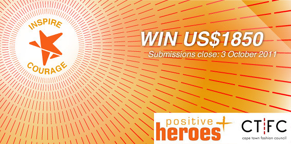
It’s time to reveal the winners of our Positive Heroes Inspire Courage design contest!
We really had some breathtaking and truly inspiring work come through from our designers. The Positive Heroes team was just as blown-away as we were and had tons of positively inspired designs to choose from.
Congratulations to our GRAND PRIZE WINNER Nicebleed for his stunning design, Freedom to Happiness!
This really is such a beautiful uplifting design.
Everyone we've spoken to found this to be supremely optimistic and perfect for spreading a positive message of hope!
Well done also to our 2 runners-up:
Nen101's design Be a [positive] Hero and Macuz's design Love.
Both of these designs had loads of fans and suitably impressed Positive Heroes with their positive and inspiring messages of courage and hope.
The Positive Heroes annual Fashion Show BLOOM is coming up very soon - Thursday, 3 November.
We will be printing 80 t-shirts of the winning design to be worn by the Positive Heroes team and volunteers at this event.
The top 3 designs will also be printed on A1 stretch canvases to be auctioned off at the event and included in the Positive Heroes Crowdfunding Packages to be sold as part of a further fundraising initiative by Springleap.com - we aim to raise $100 000 for sustainable trench gardens. All proceeds will go to Positive Heroes charity.
If you would like to attend the Fashion Show, check out the Positive Heroes Facebook event page for details and buy your tickets to the event via Computicket – HERE.
We hope to see as many of you as possible at the fashion show. It will be a great event and also a perfect chance for designers to network.
THANK YOU to all the designers who made this contest such a huge success.
We asked you to design with the intent to help prevent millions of South Africans dying needlessly as a result of the stigma, fear and ignorance that still surrounds HIV.
We think you all did an AMAZING job!
show
A design contest with a conscience!
Positive Heroes is a group of ordinary people living extraordinary lives .
The Heroes work within their communities – both local and national – telling their stories of living with HIV . They show by personal example that HIV is a manageable and survivable disease . Encouraging and supporting anyone affected by HIV with powerful messages of hope .
The Heroes’ vision is to prevent millions of South Africans dying needlessly as a result of the stigma , fear and ignorance that still surrounds HIV.
 Positive Heroes promotes the belief that living positively is about living life to the full. It is about embracing opportunity , about self-expression , about feeling healthy and looking good.
… and that’s pretty much what design is all about! Filling people’s lives with hope and beauty – lifting the veil on the awesome world that we live in.
The Challenge: Use your design skills around the theme “Inspire Courage” and create a greater awareness and understanding of HIV and global acceptance of the people who live with it.
Springleap.com in association with The Cape Town Fashion Council and Positive Heroes invites designers to create a design which truly illustrates the COURAGE that is needed to overcome the stigma surrounding this epidemic and to live life to our fullest potential.
There is no reason why people living with HIV shouldn’t live long, happy, healthy and fulfilling lives, just like everyone else. Help us create a picture of courage.
ANYTHING is possible if you know and manage your status!
The Brief:
Positive Heroes is looking for designers to create a design – which shows that acceptance is the key to ending the stigma around the HIV epidemic – for their Unique Fashion Event to be held in Cape Town in October 2011 .
Your design must reflect a positive outlook and acceptance of your fellow man, which serves to reduce the stigma surrounding HIV. Everyone is affected by HIV in some way – so your perspective should reflect both those who are living with HIV and society as a whole.
Courage must come from both sides. Stigma starts with the HIV+ individuals feeling shame about themselves, and is mirrored in society turning away from them. The result: people become isolated from friends and family and end up dying alone. Beating stigma and shame mean admitting and accepting your status and that of those around you. Acceptance and connection are key to beating this disease. We need courage to ask for help or support and courage to give it to those who need it.
Positive Heroes is all about “ordinary people living extraordinary lives”. Be one of them.
Your design should inspire people to get tested, to know their status. To get help, find support, stick to their medication and keep them from infecting other people if positive. And to stay HIV free if negative .
Help “inspire courage” – end the shame – and save lives!
COMPETITION DO’s and DON’TS:
1. Designs must please include the Positive Heroes logo in the original colours
2. NO BLACK T-SHIRTS . WHITE is the ‘preferred’ t-shirt color choice, however other colors are welcome.
3. The Positive Heroes corporate colors are pale grey and two shades of orange. However, designers are welcome to experiment and come up with their own interpretations for the design layout. Remember that the logo needs to stay in its original colours.
4. Positive Heroes intends to dress their staff, Heroes and Ultra-Marathon team in the winning t-shirt design when they are out in public. This means that the design needs to illustrate clearly who they are and what they do.
5. Positive Heroes currently gives away t-shirts throughout South African communities, both rural and urban when doing outreach work. Ideally the winning design will replace, or become one of these promotional t-shirts.
TO GET STARTED, DOWNLOAD THE BRAND ICONOGRAPHY / INFO PACK BELOW

DOWNLOAD the Springleap t-shirt Submission Kit to get all the templates and submission guidelines.
CLICK HERE to go directly to the VOTE PAGE.
Dates:
Submissions for designs open: 03 August 2021
Submissions for designs close: 07 October 2021
Voting starts: 29 August 2021
Voting ends: 26 October 2021
Winner announced: 27 October 2021
Prizes:
PRIZE MONEY:
First prize – US$1250
Second prize – US$300
Third prize – US$300
FASHION SHOW:
The winning designs will be printed to be worn and displayed at the Positive Heroes Unique Fashion Event (held in partnership with the City of Cape Town), which will take place at the Cape Town Civic Centre on the 03 November 2011.
AUCTION:
The winning designs will be auctioned off on the night of the event on A0 stretch canvases for fundraising.
CROWDFUNDING:
Winning t-shirts will also be used for corporate and consumer crowdfunding packages, the proceeds of which will go to Positive Heroes intitiatives. Once we announce the winners, we will inform the community of links to the crowdfunding site we will be working with.
These packages are:
Bronze – $30 will get you the winning T-Shirt
Silver – $80 will get you the winning T-Shirt and the runners up
Gold – $160 will get you the winning T-Shirt and the runners up for yourself, plus a pack will be sent to kids at a school / to members of an HIV support group / grassroots HIV organisation
Platinum – +$790 will get you the gold package plus listing on this post, and on the Positive Heroes site, plus a high quality A0 size stretched canvas print of each of the prints
DIAMOND –$5700 will get you 220 t-shirts with your business name on the back of the t-shirts sent to you kids at a school / to members of an HIV support group / grassroots HIV organisation plus a high quality A0 size stretched canvas print of each of the prints
GALLERY EXHIBITION:
The winning designs, as well as a selection of other top designs from the competition, will be put on show at a gallery exhibition in Cape Town and auctioned off as canvases.
RULES:
1. No obscenities or hate speech.
2. Only original works will be accepted.
a. Positive Heroes should be the focal point of the design. The Positive Heroes logo should appear somewhere on the garment. You can download the logo here.
b. WHITE is the preferred t-shirt color, however all other colors besides BLACK are acceptable.
c. The Positive Heroes Corporate Identity guidelines should be followed in terms of the color palette. See the color palette here.
3. Each designer may submit up to five designs.
4. Winners will be chosen by the Springleap design panel, in conjunction with Positive Heroes.
5. Standard Springleap terms and conditions apply over and above.
6. Positive Heroes and Springleap reserve the rights to request the high-resolution artwork of any entry submitted into the “Positive Heroes” design competition for non-commercial benefit such as media covering the process.
7. Positive Heroes reserves the right to display all procured designs in the Move! magazine, on the Positive Heroes website, on promotional materials and at any Telkom Pinnacle exhibition or event.
8. The winner consents to having their photograph and works displayed in/on/at any of the above items.
9. The competition will run from 03 August 2021 to 19 September 2011. Winners will be chosen by a panel from 03 October 2011. The winner will be chosen and announced on 7th October via the Springleap.com website, in the following issue of Move! Magazine and on the Positive Heroes website.
Confused or uncertain about anything?
Post your questions about the Positive Heroes theme competition below or click our online support button to the left of our header.
Good Luck and Happy Designing!
|
mhh
shoutBack on 8/8/11 by turtledude
|
|
Nice one UncleHani :)
shoutBack on 4/8/11 by DuncanBoxie
|
|
Come Mozambique floods, come snow, Imma do this!
shoutBack on 4/8/11 by UncleHani
|
|
Totally, this is for such a good cause!
shoutBack on 4/8/11 by DuncanBoxie
|
|
What an awesome and inspiring campaign! I cannot wait to see the submissions.
shoutBack on 3/8/11 by CathRon
|
none yet
show
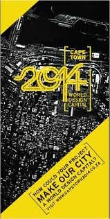
Cape Town has just been named World design capital 2014.
This is some seriously BIG news everybody. The sheer magnitude of what this announcement means for design in South Africa is astounding!
This will serve as a massive springboard for South African design, which will help grow potential design talent and spur some much needed investment into, not only Cape Town, but South Africa as a whole.
The fact that Cape Town has been named World Design Capital 2014 reflects on us positively as a nation and shows that we are a country to watch as a future ‘Mecca’ of world-class design. It will open up the door to opportunities the likes of which we have never seen before.
 So what can we expect?
The most important factor of SA becoming World Design Capital 2014 will mean a year-long design programme where we will focus on integrating design into transforming the economic, social and cultural landscape in South Africa.
Not to mention gaining the immeasurable knowledge of design communities from around the world who will descend on Cape Town and help us soar to all new heights.
The bid itself was centred around the creation of an ‘inclusive city’ by incorporating creative design knowledge into development strategies.
It’s hard to believe the decision has finally come. Considering the bidding process has been going for over a year it seemed like this AWESOME day would never come, hehe. South Africa’s “Live Design. Transform Life” portfolio concept must have blown the selectors away. In order to beat amazing cities such as Dublin and Bilbao you really have to pull a proverbial ‘rabbit out of the hat’.
That’s not to say we don’t deserve it….WE DO!
This is long overdue in my opinion.
Go Cape Town, Go South Africa J
The mayor of Cape Town, Patricia de Lille, received the humbling award on behalf of Cape Town and expressed how deeply honoured she was to accept the title of the FIRST African city to become a World Design Capital! 
We were all Springleaping off the walls this morning at the HQ when we heard the announcement made by the International Design Alliance Congress in Taipei. Wish we could have been there….we would have danced until our feet fell off.
Springleap can’t wait to welcome the world to Cape Town.
Prepare to be astonished by our creativity and colourful design community!
none yet
show
Intricate vs. Simple design!
This is a seriously tough question! Indeed in the final analysis it always boils down to personal preference.
At Springleap.com we have a pretty wide variety of designs from either camp. In recent times the more intricate illustration style has been on the increase. We have designers like Vcalahan and JeBe who have added their considerable might to this faction.
There is however plenty of simple illustration that still comes through to Springleap…and WINS!
Firstly please don’t think that when I say “simple illustration” that I mean it with some kind of derogatory accusation of its merit. Indeed it is far from the truth. I mean it merely in the comparative sense that the design is created with less line-work and detail focus. OKOK! :P
Simple art is often looked on in some artistic circles as a lesser form of design. The fact that a design took longer to create, or has masses of illustrated line-work, does not make it ‘better’.
T-shirt design is the perfect platform for simple design, because it is all about creating a visually explosive design which has a concept that is clear and concise at a glance. The more detailed, or busy, a design is, the more difficult it is to understand its meaning at a distance, or by only catching a brief glimpse. Simple style designs are easily recognizable from any distance and make the job of ‘decoding’ its meaning less of a hassle.
This is why the ‘age old battle’ of Intricate vs. Simple design will be a war that will stand the test of time.
Fine artists will often say that intricate design is the pinnacle of design, but then they get refuted by those who love minimalism and more simple forms, such as Picasso’s famous work.
You will see that throughout this post I have added doubled-up images. One is an intricate design, the other a simple design. The reason for this is purely that you can see that regardless of their complexity they are all absolutely amazing. Take a look at Drying by Dephedwiputra and Vcalahan’s Killer Rabbit design above for example. The characterization and concept of Drying is what makes it an eye-poppingly good t-shirt design, whilst the pure intricate mastery of Killer Rabbit is what conveys not only the concept, but more importantly a sense of time and reference.
How could you say which of these 2 are better?
It’s an impossible choice…unless you have some kind of affiliation to the design and its message.
Personally, I’m a rather difficult character to please when it comes to t-shirt design, because I could never decide which of the two design styles I prefer.
Indeed for me it depends from design-to-design. There is plenty of artwork from both intricate and simple corners that I dig and just as much that I can’t bear to look at, LOL.
How about you guys and girls what do you prefer?
Do you think the Intricate vs. Simple design battle is something that can never truly be won by either movement?
none yet
show
Summer is on our doorstep!
That means it’s time to pack away those wooly-jackets, smear on that sunscreen and most importantly…find some killer hot sunglasses for the season.
I have actually been in the market for a new pair of shades for a few months now, which invariably meant that I did quite a bit of research. In the end I whittled a huge variety of men’s sunglasses down to a very short list indeed.
Here are my ‘Top 5 sunglasses of 2011’
First up we have Oakley, who actually released their South African 2011 sunglasses collection back in February. I have to say I was rather impressed with the new range. However the style that stood ‘heads and shoulders’ above the rest was without doubt the Oakley Jury. Those of you who are familiar with Oakley shapes will perhaps remember the Pit Boss style, which I consider to be a much more aggressive ‘troubled older cousin’ of the Jury. This is exactly why I prefer the Jury to the Pit Boss. While the Pit Boss turns even the most ‘calm faced’ individual into an evil looking entity, the Jury has a slightly less aggressive edge, but which also looks sleek and stylish…plus you won’t scare off the ladies or make little kids cry. The Oakley Jury style is a middle-point between the aggressive Pit Boss and the mega docile, almost emotionless chunkyness of the GasCan model.
These are super SUPER HOT!
Next up we have my top choice from sunglasses guru Ray-Ban. No Aviators I promise!
My number one Ray-Ban style for 2011 has to be the ClubMaster.
Ok, so this is very different from my usual choice in sunnies, but I just can’t seem to get enough of these awesome Ray-Ban’s. Usually gold trimmings in sunglasses send me running for the hills, but in this case the ‘bling’ has been kept to a survivable level and really gives the Club Master a nice accent of interest. For the more adventurous ‘colourful character’ there is also the ClubMaster violet-fuchsia-azure-pink striped version, which, if Dame Edna was less of a ‘woman’…would definitely wear!
For an alternative to these shades you could always try the Paul Smith Romiley variation (just outside my Top 5).
While I did joke about the iconic Aviator style earlier there is no doubting their massive appeal and popularity. When I attended the Rocking the Daisies 2011 music festival a few weeks ago I was blown away at how many people where wearing Aviators. Obviously the majority were cheap ‘knock-offs’, but the proof of the styles popularity was definitely in the pudding.
Adidas is a brand I usually associate with quality footwear and funky sporting wear. This year saw me become one of the many thousands of Adidas sunnies converts around the globe. I spotted the Adidas TERREX FAST model sunglasses on their homepage and was instantly enthralled. These sci-fi ‘fly style’ sunglasses sucked me in immediately and I knew that these were going to appear on my short-list. The white/green/black model is very slick and I think typifies the TERREX FAST model the most appropriately. If I had to buy a pair I would be hard-pressed to choose between the white and the ‘full black’ version…which looks very shnazzy indeed, much more “angry”….growl!
Their best feature are the Adidas LST (Light Stabilizing Technology) lenses, which deals with fluctuations in extreme light and glare, which prevents “rapid eye fatigue”. This is really great for sportsmen….or when you are stumbling around outdoor summer trance parties, hahaha.
Persol is a brand that I am truthfully not overly familiar with. The sunglasses that really caught my interest are the re-launch of one of their most classic styles, the Steve McQueen.
If you are a fan of old school movie ‘badasses’, chances are you will be familiar with Steve McQueen.
Often hailed as “The King of Cool”, this iconic actor has always been synonymous with style. Which is very fitting considering Persol is often looked upon in the same way in terms of stylish sunglasses. This is a limited edition release with only 10 000 being available worldwide. So – if you are as keen on these sunnies as I am, I suggest you pounce while they are still available…they won’t be for much longer. The black frame version is my favourite of the lot, but if you wanna go the original Steve McQueen route you should probably go for one of the Havanna style….both are insanely radical!
My final ‘Top 5 sunglasses of 2011’ selection goes to a brand that I first picked up on because of their insanely cool men’s boots, John Varvatos. Ok, so I must warn you, this particular brand is on the expensive side….their online store reckons that they cost $250, which should work out to around R1750, but I’m almost certain you will end up paying waaaay more than that in deep dark Africa. Earlier in this post I mentioned the iconic Aviator style from Ray-Ban. These are one of the few brands that have taken the Aviator style, modified it, and made it their own. John Varvatos’ Modified Aviators have a super cool acetate bar and a mega comfortable nose piece. These puppies are made in Japan, so chances are the quality of the product is high. The brown version of this model is certainly my favourite. The John Varvatos Modified Aviator has a clean retro vibe, which is so freaking sexy and gives a high-class look, whilst still exuding an aura of freedom/playfulness.
Choosing a new pair of sunglasses for Summer 2011 is going to be difficult.
Considering at the moment that I wear a pair of Oakley Frank Kozic Artist Series HIJINX, it will be difficult to 'move away' when I already know just how brilliant the Oakley HDO lenses are!
Which of these 5 of your favourite’s guys? Do you feel like I have left out a style that HAS TO BE INCLUDED in my Top 5 sunglasses of 2011?
I would love to hear your opinions J
Also before I get slapped, the sunglasses I have chosen here are mostly for the guys…because, well, I am one J
I will have to do some proper research to give you the same list for the ladies…I’m on it!
PRICES:
Oakley Jury - $190
Ray-Ban CLUBMASTER - $145
Adidas TERREX FAST - $280
Persol Steve McQueen - $280
John Varvatos Modified Aviators - $250
Protect those eyes boys and girls.
Do it right and with serious style!
D
none yet
show
Hi there one and all,
Well another Monday arrives and most of us are probably feeling smashed from a busy weekend….c’mon, hardly anybody has chilled weekends anymore hehe.
I wanted to pick a designer who would give us a serious kick in the ‘Julies’ to help jump-start our week with a bang. This is design inspiration which will leave you feeling like you just took a nitro uppercut to the jaw!
The designer I decided to use is a talented Portuguese character artist named Jose Alves da Silva.
I have seen his designs around, but it wasn’t until I spotted his K.O. design, featured as the ‘Image of the day’ on ImageFX, that I knew for certain that this was the type of work I want to show you.
This mega-designer has been rocking the industry for around 15 years and seems to improve and evolve his design prowess exponentially. He has won the coveted Master Award at the super competitive CGSociety Challenge XXIV. Not to mention that he has appeared in many publications, such as d'Artiste, Digital Art Masters and 3D Creative….to name but a few.
Jose Alves da Silva’s ‘devilishly’ cool K.O. design is bursting at the seams with massive personality, which makes you wanna recoil and hide from its demonic central figure. Sheesh, nobody wants to go toe-to-toe with the champion of the Infernal Pits Boxing Club.
I mean just look at that chin. He could jam your head underneath it and pop your head like a grape…sploooch!
I have a serious penchant for character design and let me tell you, this is some of the best I have seen in a very long time. The amount of emotion and depth every single one of his characters exudes is astounding.
It’s not just the characters, but the ‘mood’ of the worlds he creates for them which sets him apart. Take a look at his Mr. Reaper design below. It has an amazing constructed fantasy landscape which suits the epic undead hero perfectly. Not to mention that Mr. Reaper I so nicely incorporated into the scene…proportionally I mean. The movement of the design is really something!
If you would like to check out his tutorial for Mr. Reaper CLICK HERE….it’s awesome ;)
You must also have a lookie at his 3D design work, in particular his ‘bootilicious’ Booty Bobbler, it will make you chuckle, hehe.
To see more of Jose Alves da Silva’s amazing art and get even more design inspiration, please cruise across to his official page.
If you have him in mind for some freelance work you can contact him at: jose.zeoyn [at] gmail [dot] com
BAMBAMBAM!
Hows this for some serious design inspiration on your Monday morning….hurts so good doesn’t it.
JOSE ROCKS….I’m INSPIRED!!!
none yet
show
Hi there Springleapers,
I just wanted to do a quick posting related to the specifications needed for sending through final artwork when you win one of our contests.
Specifications are different from site to site, so best to arm yourself with the correct details.
This is what Springleap.com needs from you:
Your artwork must be sent through in the following formats - psd, ai, fls, or fh format
These are the only files we accept, please do not send through any tifs and jpegs.
Also, VERY IMPORTANT, but we need you to send through your designs in CMYK. Ensure that you check that your designs are not being set as RGB when they come through to us.
RGB light is very intense as its intended for screen, while CMYK is pigment intended for print. The result of converting to CMYK from our side means that it doesn’t appear exactly as the artist intended. We would then have to select colors from our side to make it match as closely as possible. I’m sure the designers would rather send through their exact color values ;)
We can replicate it pretty closely, but it will never be perfect!
If you have any questions please feel free to drop me a mail – Duncan [at] springleap [dot] com
Happy designing!
You need to be logged in to post blogs.

Sharing is caring
(don’t keep it all inside. You might explode)